|
For our final portfolio project in Advanced Media Arts, we were given several options as always to select for our last project. While at first I wast tempted to create a new music video or short film, I decided that with the other academic events coming up, creating a movie poster for my music video Isolation that Makaela Zavala and I created last year was the best choice for me. Isolation is a music video based on the song Lovely by Billie Eilish and Khalid. The focus of the video itself was on depression and struggling with mental health during the quarantine. For this video, I was the actor and editor while Makaela did the videography. The video itself was very well received and I also got some helpful feedback from several viewers. For the actual movie poster that I was going to create, I was initially unsure of what I wanted to do. I originally thought of creating something entirely new but never came up with any designs that I liked or felt fit. After this I ended up using a still from the video, specifically during the intro when the alarm on the phone introduces the short film. The actual still itself had a few different dark gray shades and some black which inspired me to create other shapes to create a design using those colors. With all of my designs, I like to keep them very simple and the dark looks of the poster fit what I wanted. I debated whether or not to use a second still (moving the first to the top left and the new one to the bottom right) to also reveal our names but felt this cluttered the poster itself. I also had to increase the contrast of the still as it was difficult to see any of the other shapes surrounding the phone. Overall, I personally like the design due to the simplicity but feel like spending more time on creating more drafts not utilizing the stills would've allowed it to be even better. 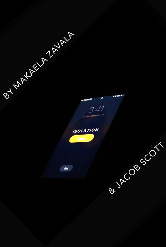
0 Comments
For our last portfolio opportunity in Advanced Media Arts, we were limited to a more confined list of options for our final product. While I originally decided that doing another film or video would be interesting, I thought I would use this opportunity to dip my toes into the water. In other words, I would be working on the yearbook. My initial focus was on the Girl's and Boy's soccer pages as I knew most of the players and could get their feedback too. As a former soccer player, this also helped me differentiate between the good, the bad, and the ugly. Unfortunately, a large amount of the photos were out of focus making them completely unusable. As a result of this, several players were also left out due to the quality of the photos. After several rounds of feedback from the players, you can see the final product of the pages below. I received mixed feedback on including captions featuring the player's names which I may end up going back and including after this regardless. In addition to these 2 pages, I also worked on creating 2 pages featuring a variety of New Tech students as well as a few teachers. The last set of pages were highlighting our entrepreneurship class. It was a little challenging to find photos that weren't very event specific to feature groups of students as most of them had their own dedicated pages already. Another big challenge I faced was creating the entrepreneurship pages as the photos that had been taken don't really represent what DireLights is about. I'm hoping we can get another photographer in the next few days so I can replace some of the photos and hopefully show some of our employees making candles too. Overall, I'm glad I tried something different, although I quickly discovered that yearbook probably isn't a good choice for me in the future partially due to the selection process. 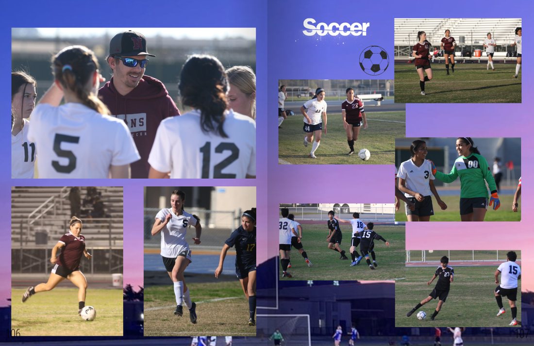 For our most recent project, 3-2-1 Short Film, students had the requirements of a 3 minute short film with 2 characters and only 1 location. We were also required to choose from a list of 3 prompts that consisted of: the journalist, the choice, and the broken time machine. This film could be done individually, duos, or as many people that you can attempt to fit in one project. However, each team member had to create their own edit of the film in some capacity. After selecting our prompt and our team, we started the creative process. The first important part of this process involves creating a storyboard. A storyboard is a rough sketch of the scene, including the camera angle, and movement within the scene. Personally, I worked with one other person and we decided on the prompt, the broken time machine. Before we started the storyboard, we wanted to brainstorm ideas together. The idea that we ended up running with was a silent film. To elaborate, the main character would time travel to a different time period (the 20s) and be unable to speak. To follow the prompt, the character also ends up being stuck in the 20s and accepts their fate. After figuring out all of the camera angles and movement out, we put it together on the storyboard. All of the storyboard's content was subject to change in the filming process as we unexpected events or better ideas came along. After deciding on a day to film, we put all of our clips together to create a very rough draft of our film. Due to the circumstances during the film day, couldn't shoot a handful of the scenes which led to our film being under 3 minutes. Following this, we worked on editing the clips until we got another chance to film. My partner and I also received feedback during the editing process. Once this was done, we put the final clips into the rough draft and finalized it. The only things left to do were to make another edit which had some differences in audio, and then we finally submitted the film to the Central Coast Film Society competition.
For our most recent project, we were given a portfolio opportunity in which I chose to focus on creating several different banners for Link Crew. Choosing this opportunity meant creating 6 different banners which were as follows: 2 event banners with arrows, a graduation banner, a CCNTH Event Parking banner, a Permit Parking Only sign, and lastly a Welcome to Our Pack banner. The size of these banners were 25"x36" with the exception of the sign and Welcome to Our Pack banners. These were 8 1/2"x11" and 48"x36" and aren't intended to fit on the sandwich board the others were based on for reference. I started out by creating the permit parking only sign as it was the most out of place compared to the others as they're banners. For all of my designs, I wanted a simple and clean look as that's more so my style than something flashy. Another consideration was that these would be printed out and too much color would likely be a bit pricey but in all fairness, the guidelines for the banners were pretty loose. For the 4 event banners, I decided to reuse the same format and adapt as needed for the individual banners requirements. On the topic of the format and layout, I wanted to leave plenty of space to avoid any clutter. When it comes to the color palette, I wanted to follow along with the school colors aka our Direwolf. I focused on the primary and secondary colors of the gray and shades of blue while avoiding the orange as it wouldn't fit in artistic opinion. Next, I worked on the graduation banner which I originally had the text vertically aligned and changed at the last minute to utilize space more efficiently. Lastly, I completed the Welcome to Our Pack banner that followed along with my previous designs. I think all of these would look nice with a different color scheme and I even messed around with the idea of a gradient. Ultimately, I like the designs I created and hope they may see usage in the future despite my taste for simplicity.
For this most recent project, students were provided with a variety of options to pursue. The option that I ended up selecting was 3D photogrammetry. This can be done with the software known as Agisoft Metashape which converts photos into a 3D model. As a member of DireLights, our student-run candle business, I thought it would be fun and a great learning experience to try and create a 3D model of one of our candles. During the first round of photos, I ended up getting 3 different angles of the candle standing upright, upside down, and on its side which collectively totaled to around 500 photos. After importing them into Lightroom, I later added the photos into Agisoft Metashape to start the first long process of waiting. Upon seeing how long it was going to take to import them (around 6 hours if I recall properly), this process was stopped short and my new goal was to take around 100 photos this time. After the photos were imported, they were then aligned, a dense cloud was created, and a mesh was built. The last step of creating the model was to build texture and voila it was complete. With all the time it took to build the model I was eager to see how my work had turned out. As you may have already seen below, it appears that half the candle is missing, similar to being shot with a gun rather than a camera. Despite this, I feel that this turned out very well for it being my second time trying to create a model. The parts of the candle that didn't show up much, if at all, mostly consisted of the metal lid and the back of the candle where it was uncovered. The lack of detail between the pictures for these sections must not have been recognized and was simply removed. Speaking of removal, the parts of the lazy Susan that are seen near the lid can be selected and removed. Other touch-ups can be performed in regards to the model too but would be time-consuming with the time provided. I'm excited to hopefully work on this in the future as we learn more about the creation process which we know very little of. Thank you to Mr. Oliver for downloading the software onto his laptop and allowing me to use it for this project. 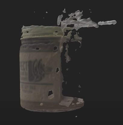 I hope you're all doing well this week! Today I will be going over a project we're wrapping up in Advanced Media Arts. The project provided us the choice of designing an LMUSD CTE Career Technical Education Logo, CCNTH 10th Anniversary Logo, or a DireLights 10th Anniversary Logo. To clarify, the DireLights option is to celebrate the CCNTH 10th anniversary, not DireLights. I decided that I would design a new logo for DireLights as opposed to the other two options. The first benchmark we had was to create 10 different sketches before we jumped right into Adobe Photoshop or Adobe Illustrator. Unfortunately, I don't have the sketches available, but I wanted to keep the logo simple and avoid changing any significant aspects of the existing DireLights logo. I was inspired by one of my peers who made part of the Direwolf logo into a 10 for the anniversary. This gave me the idea to separate the candle from the rest of the logo and incorporate a 0 in between. The method behind the madness was that the candle made a unique and fitting 1 in the 10 without really removing any assets. I also experimented with other sketches just including the characters 10 Years! along the sides of the logo although this wasn't very aesthetically pleasing to me. For my final sketch, I inserted the 10 Years! in the candle, which I thought was very clean. Using Illustrator, I digitally recreated the sketch and had extra work time on my hands. Thinking of the black DireLights shirt I received in EM1, I remembered how well the logo looked in white. After this, I made another copy of the file and inverted the colors to support this new idea. Our next step was to do critical friends in which I made slight adjustments to the characters to align them and removed the ! as it was deemed unnecessary. For my final draft, I included the preexisting asset of our slogan, "Let some light in", which was well-received by my peers. The last steps before the presentation were to create a mock-up of your logo and create a slide deck. For the mock-up, I simply opened the blank candle file and logo in Photoshop and warped the logo to appear as if it was wrapped around the candle. After presenting, the only next step I have to improve the logo is to cut the characters of 10 Years so it won't appear white on our brown labels. You can view my logo and mock-up below! 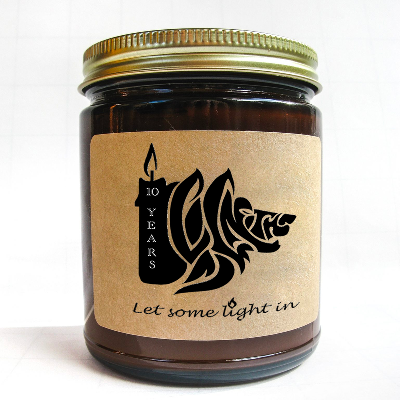 |
